An AI-powered platform helping homeowners find and visualize personalized artwork before buying.
MatchAi
Art
Project Overview
Shaping Our Vision
Early Sketches & Ideas
Design Decisions
Hi Fi Mockups & Prototype
Lessons Learned & Next Steps

Project Overview
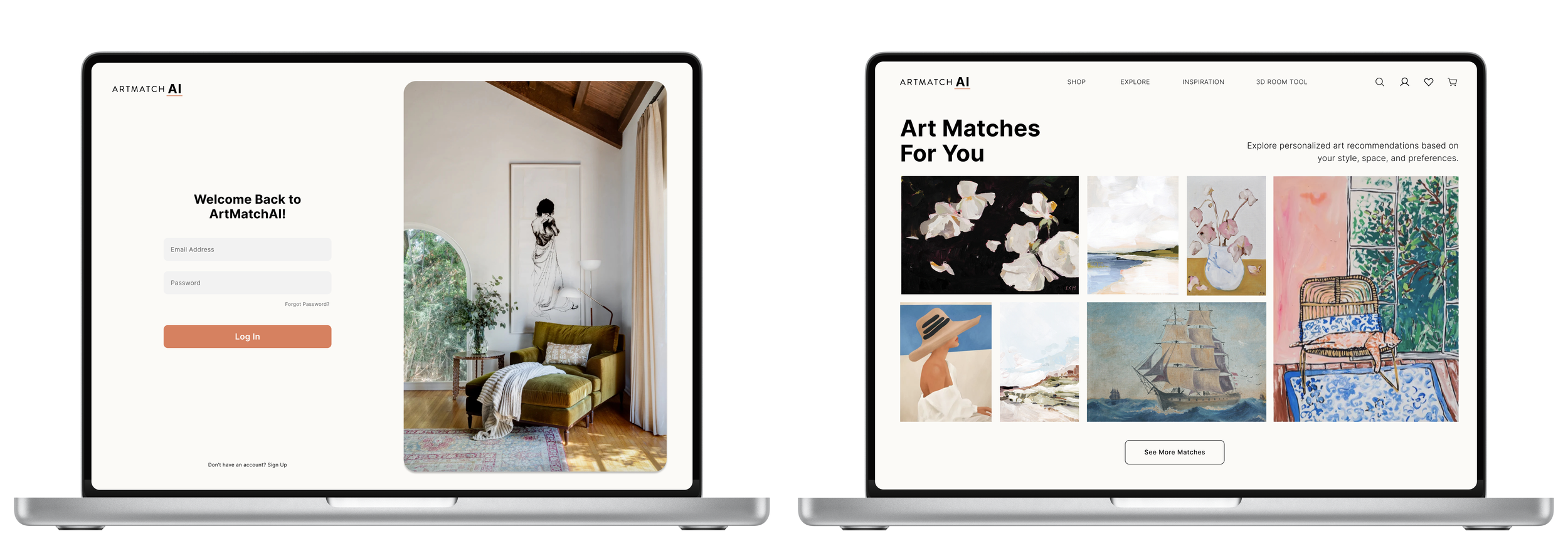
ArtMatchAI is an AI-powered platform that helps homeowners and renters discover personalized artwork that fits their style and space.
As the sole designer, I created a user friendly experience centered around tailored art recommendations, 3D visualizations, and intuitive discovery. I shaped the visual identity, UI system, and key features by designing interactions that made discovering and selecting art easier while helping the AI better understand user preferences.
My Role
Product Designer (UX/UI)
Timeline
5 Weeks
Tools
Figma
Project Context
This was a brand new product, and I was brought in to design the experience from the ground up. I worked alongside a cross functional team of product managers, data scientists, and developers to define the core functionality, shape the visual identity, and build the UI system to bring the AI powered vision to life.

Problem Statement
Finding art for your home can be overwhelming, especially without design experience. Most online platforms offer generic recommendations and endless options, making it hard to visualize how a piece will look in your space or fit your personal style.
Solution
ArtMatchAI uses AI to recommend artwork tailored to each user’s style, preferences, and budget. With 3D previews and personalized suggestions, the platform makes discovering and selecting art feel simple, visual, and confidence-building.
Goals
Create a simple, intuitive web experience
Establish a consistent visual identity and UI system for future scalability
Ensure art discovery feels personalized and relevant to each user
Build a natural interaction flow for users to engage with art, helping the AI learn and improve recommendations
Develop a process for users to visualize art in their space before buying
Shaping Our Vision
Before diving into design, I needed to better understand the art e-commerce market, our competition, and what our product would help solve for the user. I focused on:
Informal Research & Insights
Competitive Analysis
Identifying Gaps in the Market
Informal Research Review
When I joined the team, the concept had already been validated through early market research. While I wasn’t involved in the initial discovery phase, I reviewed all available research to understand the product vision and user goals. These insights helped shape my early design decisions and ensured I was aligned with the needs of our future users.
Collaborated with the team to understand our target audience of homeowners and renters.
Reviewed competitor feedback and industry trends around art discovery and personalization.
I analyzed and compared multiple leading art discovery platforms to identify their successes and shortcomings. This helped me understand industry standards and user expectations for art e-commerce platforms, while also revealing key gaps in the market that ArtMatchAI could uniquely address.
Competitive Analysis

After reviewing the research and competitive analysis, I found that users in the art discovery space consistently faced a few key challenges:
Gaps in the Market
User Pain Points
Overwhelming choices: Most platforms present endless art options without smart filtering, personalization, or recommendations tailored to a user’s style and space. This often leads to decision fatigue.
Hard to visualize art at home: Users are shown static previews or generic staged room images, making it difficult to picture how a piece will actually look in their space.
Lack of price transparency: Few platforms offer smart comparisons across multiple marketplaces or help users stay within a set budget. Pricing often feels unclear or inconsistent, making it hard to gauge value.
Key Takeaways
Lack of personalization: Most platforms prioritize volume over relevance. ArtMatchAI can differentiate by delivering a highly personalized and tailored discovery experience.
Need for AR visualization: Many platforms lack advanced visualization tools. Integrating AR can allow users to see art in their own space, helping them make more confident purchase decisions.
Limited budget tools: Price comparisons across platforms and budget optimization features are scarce. This presents a unique opportunity for ArtMatchAI to offer true value by helping users stay within their budget.
Starting from the ground up presented many opportunities for the design, but it also meant there were countless directions to consider. I used sketching to generate initial ideas before moving on to mockups, where I iterated and refined those concepts.
Initial Wireframes
Design Evolution
Early Sketches & Ideas:
To narrow down my options, I created multiple wireframe sketches to visualize ideas and identify the best direction for the design. This process helped me explore different layouts and features quickly, allowing me to focus on the most promising concepts.
Created rough sketches to explore layout options, focusing on clarity and simplicity.
Emphasized visual hierarchy and effective use of whitespace to minimize cognitive load.
Initial Wireframes


Design Evolution
As I transitioned from wireframes to high-fidelity mockups, I continued to refine the design. I adjusted elements and iterated on the layout, making sure the pages evolved naturally as the product started to take shape and come together visually.
Iterated on designs with team feedback, refining elements like navigation and artwork display.
Implemented a search feature as a key function for users to quickly find art based on preferences and past searches.
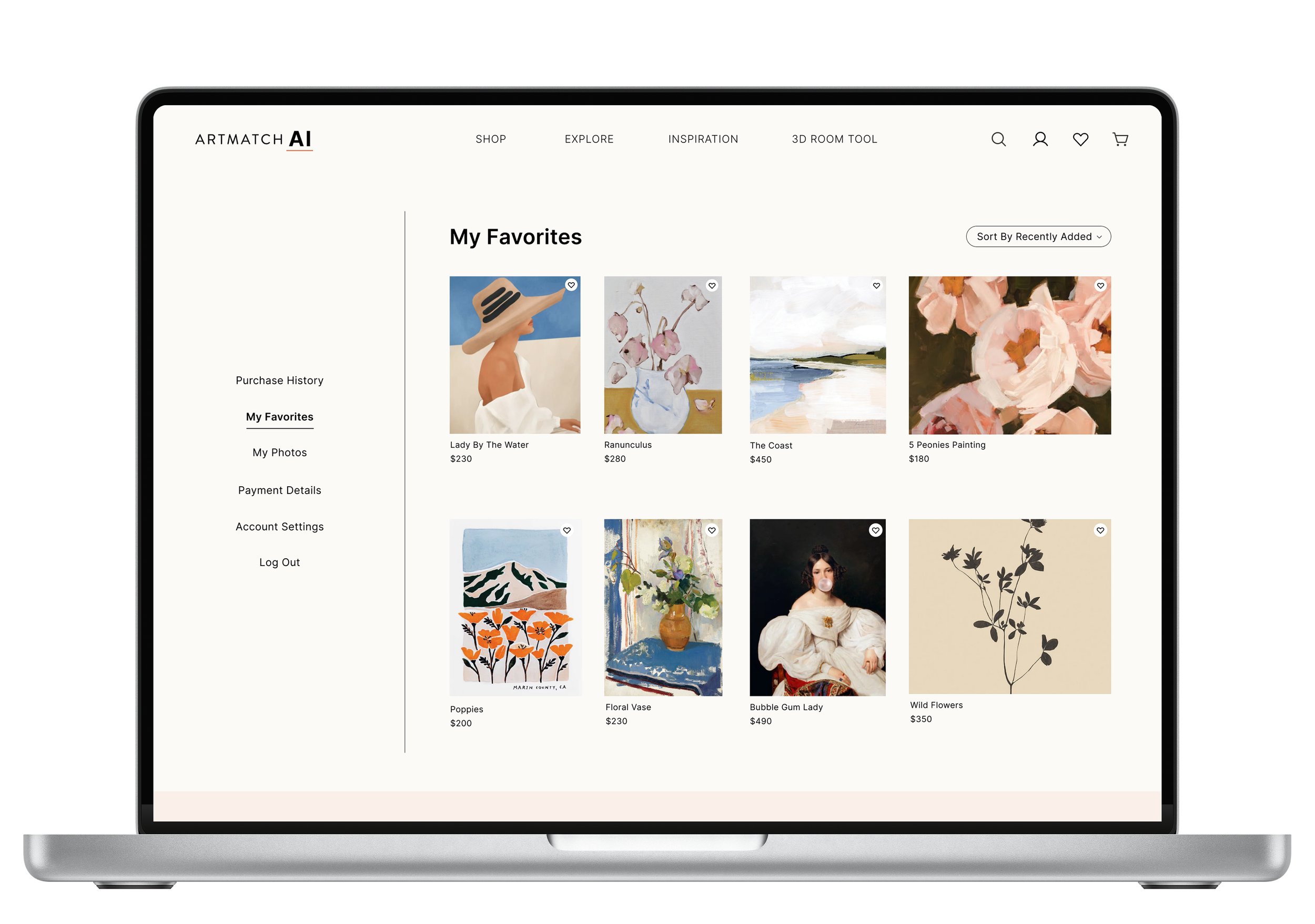
Added interactive buttons (like, favorite, hide, share) to help AI learn user preferences for curated suggestions.
Included clear categories and smart filters to simplify discovery and help users navigate the art catalog with ease.


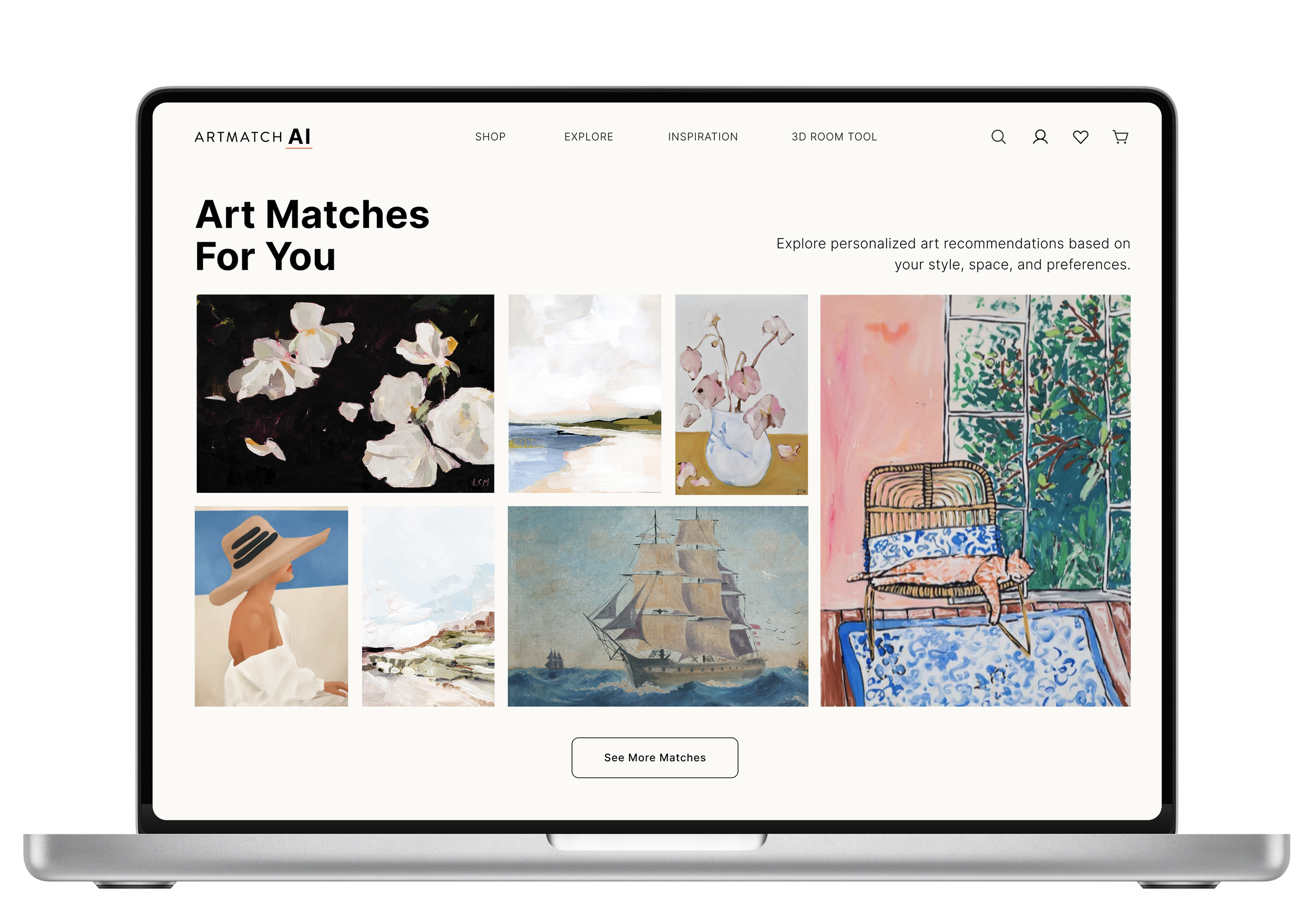
Design Decisions
Every design decision was made with the user journey and experience in mind. I focused on creating an enjoyable, intuitive way for users to discover and interact with art, removing unnecessary obstacles along the way.

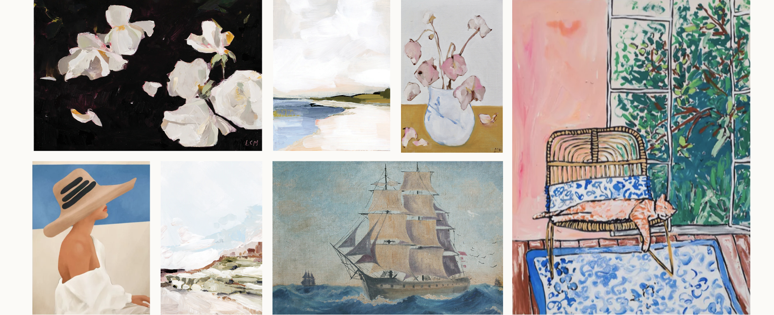
1. Our Interface Aesthetic
Showcasing art means working with a lot of competing visuals, colors, and patterns on the screen at once. To avoid overwhelming users, I focused on creating a clean, modern interface with generous white space that keeps the artwork front and center.
Used visual hierarchy and white space to guide the eye and reduce cognitive load
Took a minimalist approach to keep the experience calm, focused, and engaging
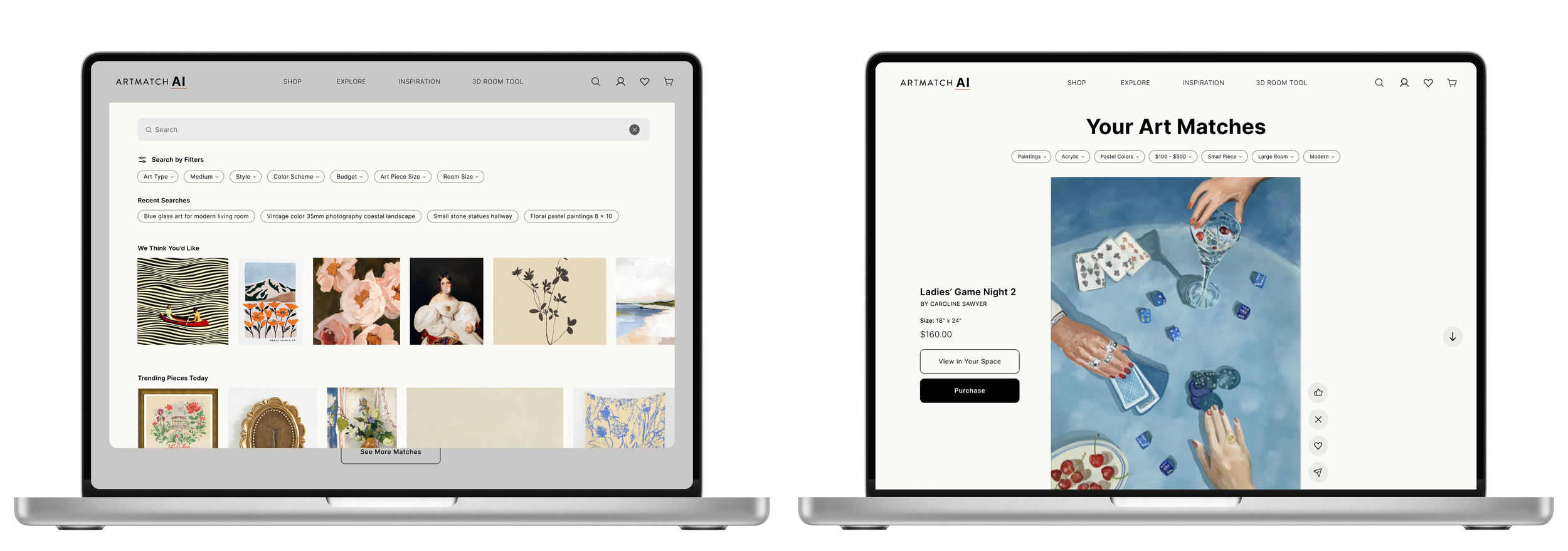
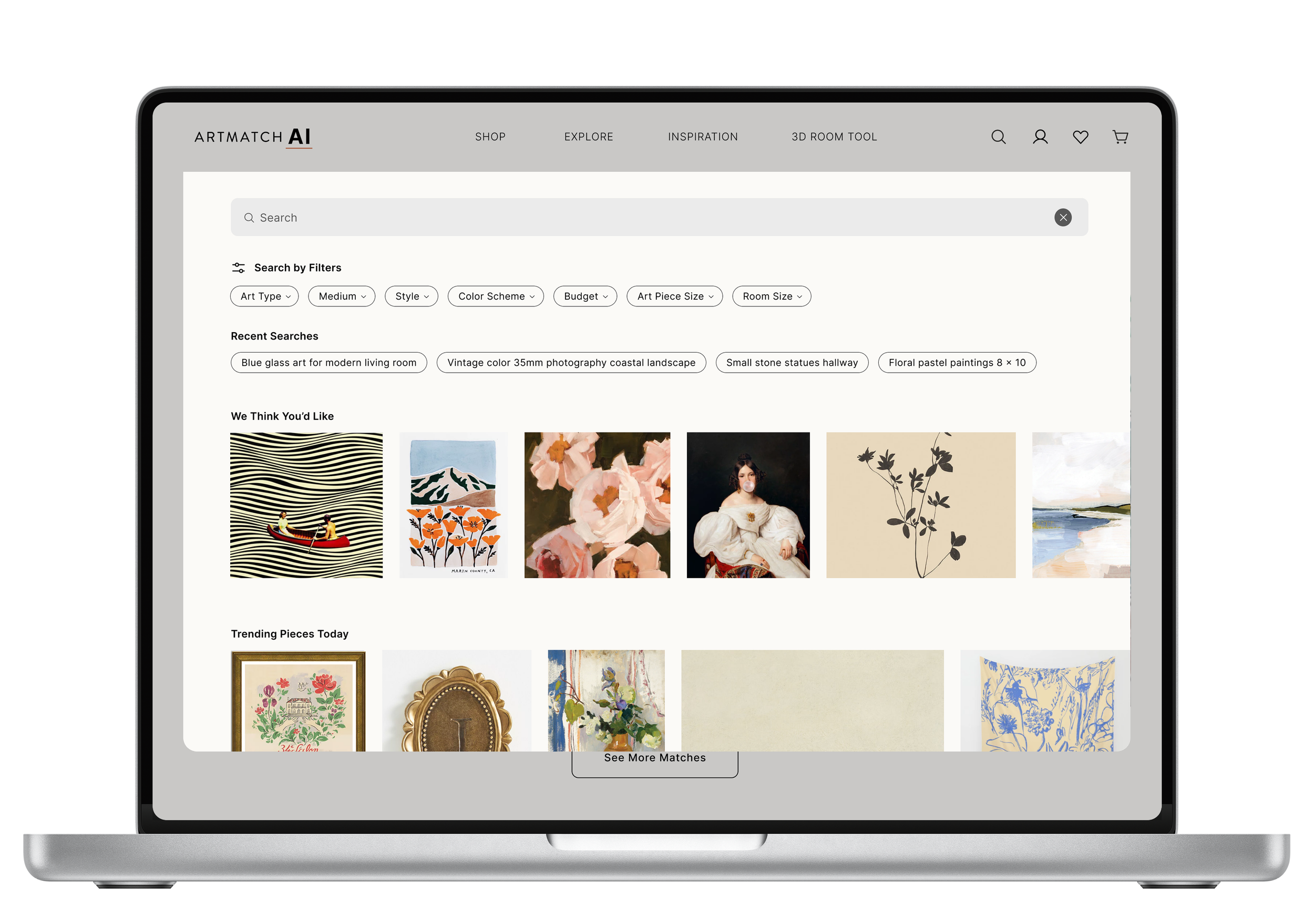
2. Search Feature
We knew we needed a strong search experience to help users navigate a large and diverse art catalog, but a basic search bar wouldn’t be enough. So I designed a visual-first search that spanned the full width of the page and was accessible from anywhere on the site, making exploration feel intuitive and inviting.
Included filters like material, color, and style to support meaningful discovery
Surfaced past searches, trending topics, and personalized terms to spark inspiration and help users revisit favorites
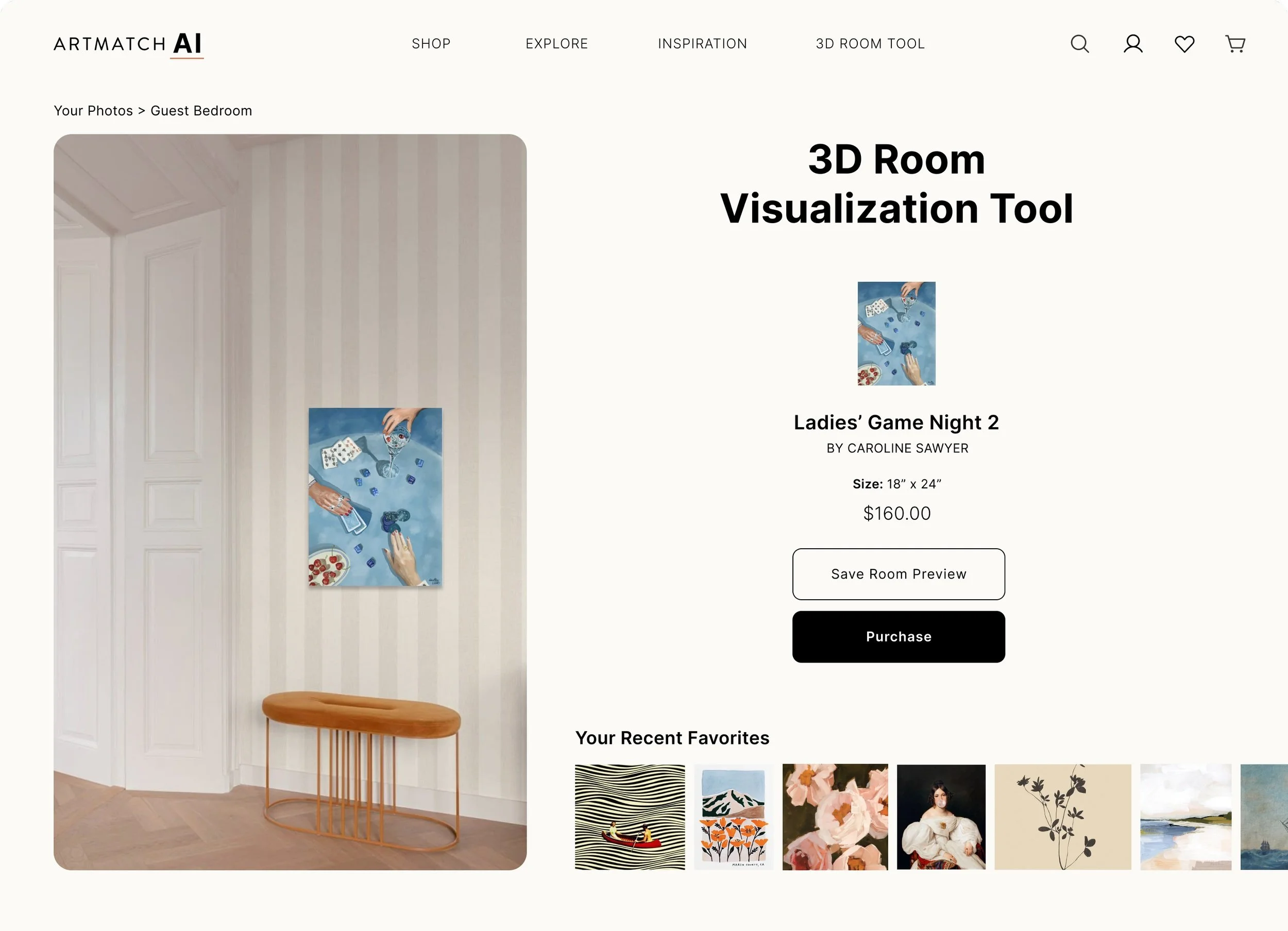
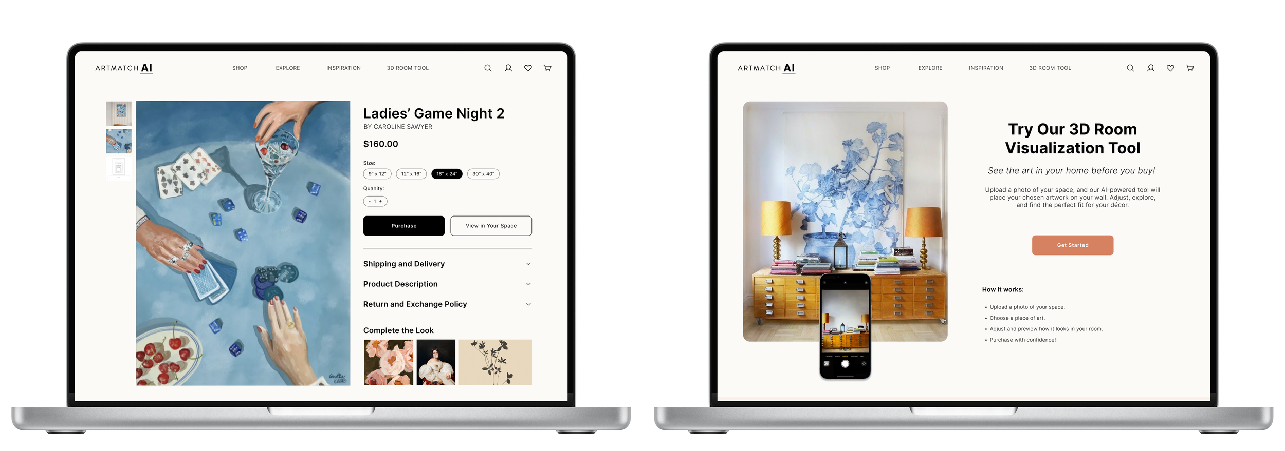
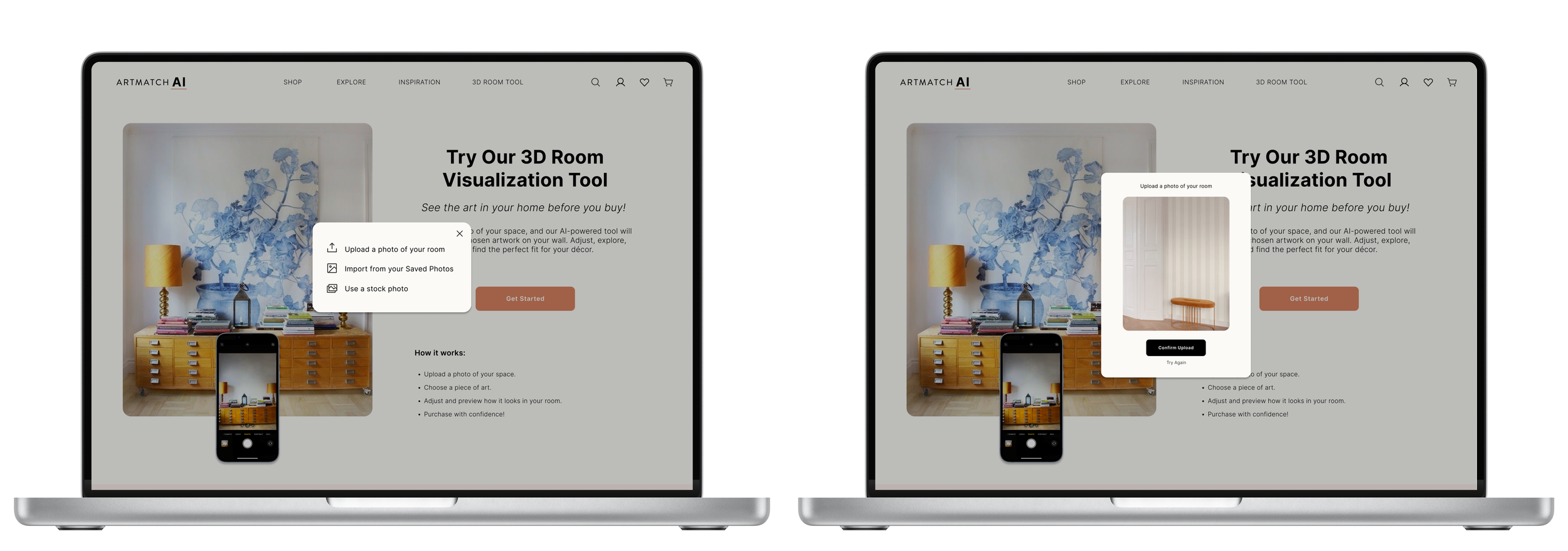
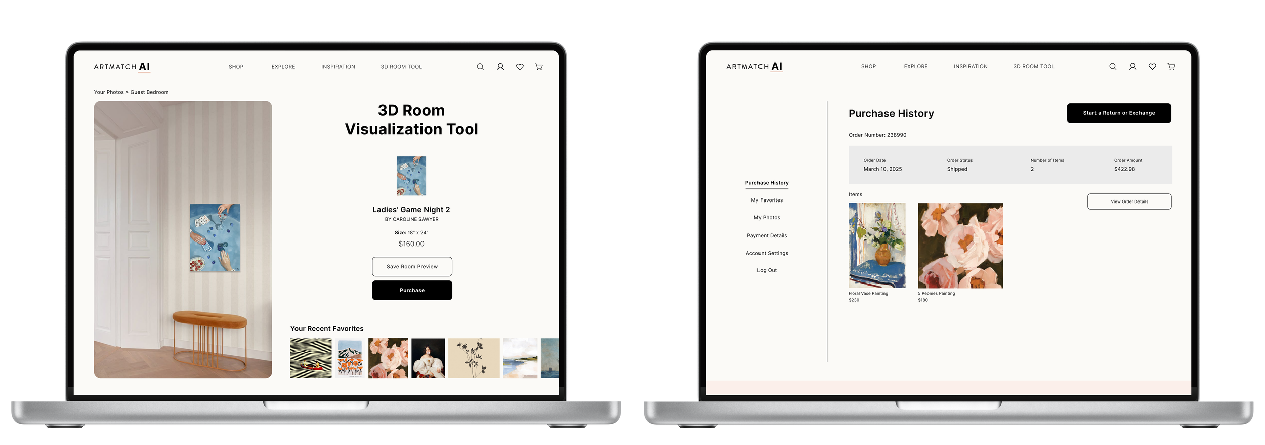
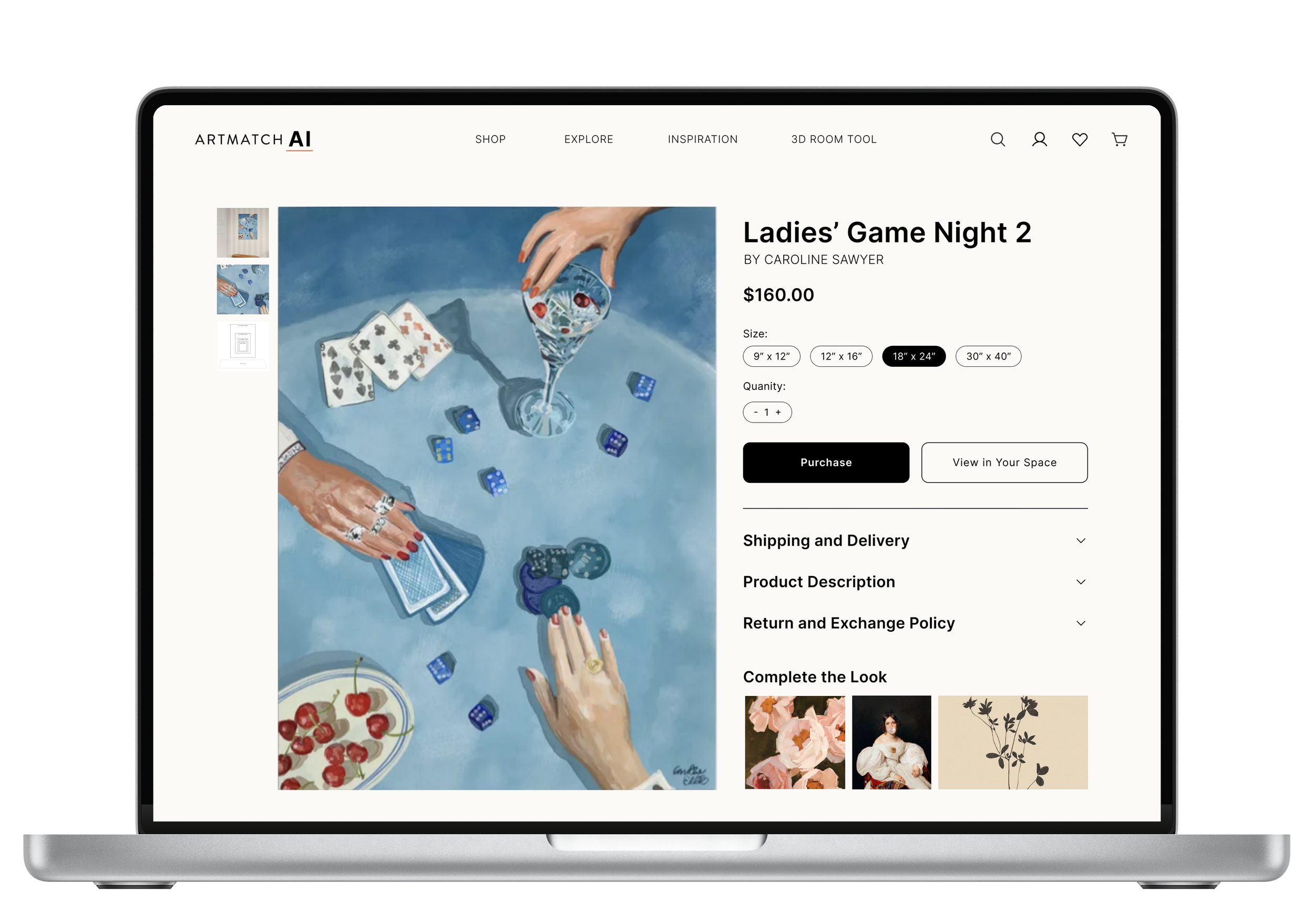
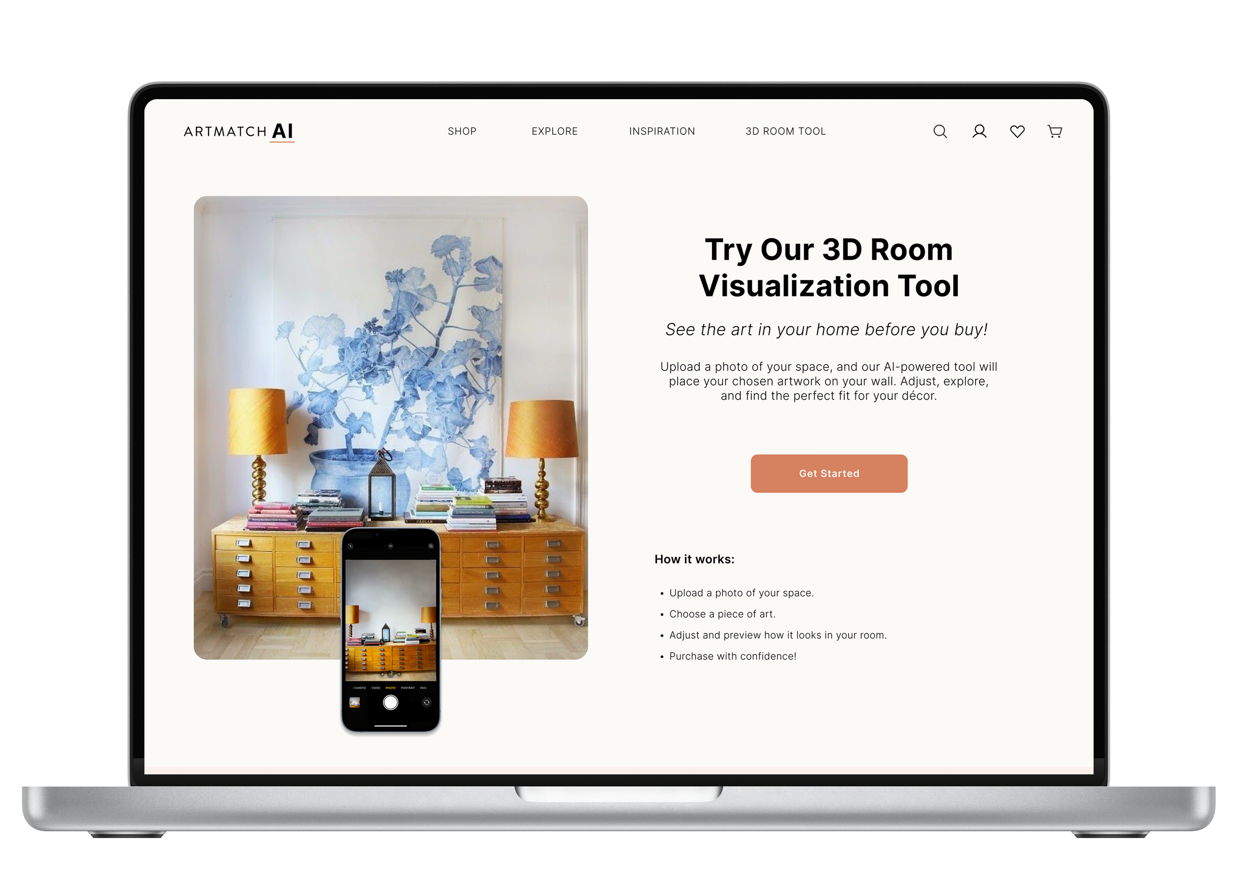
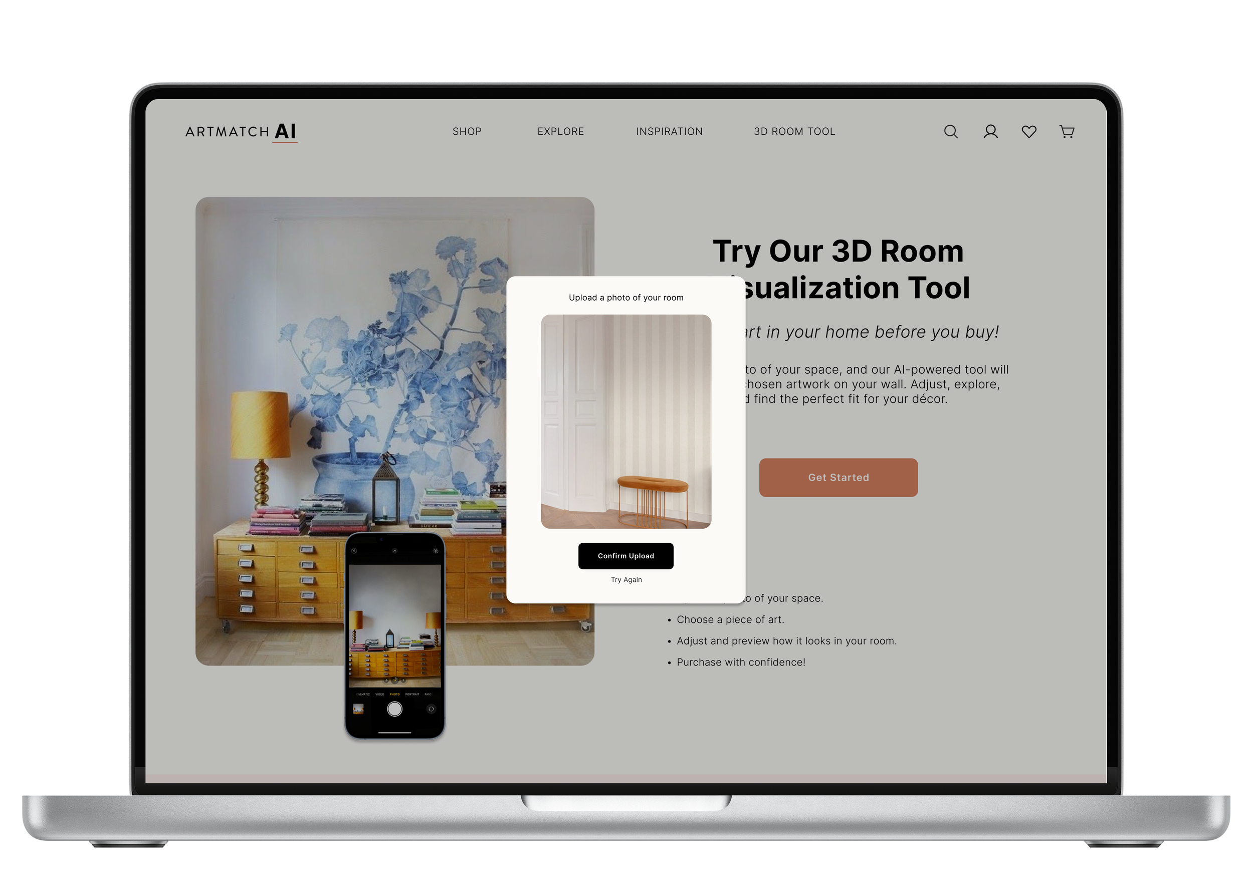
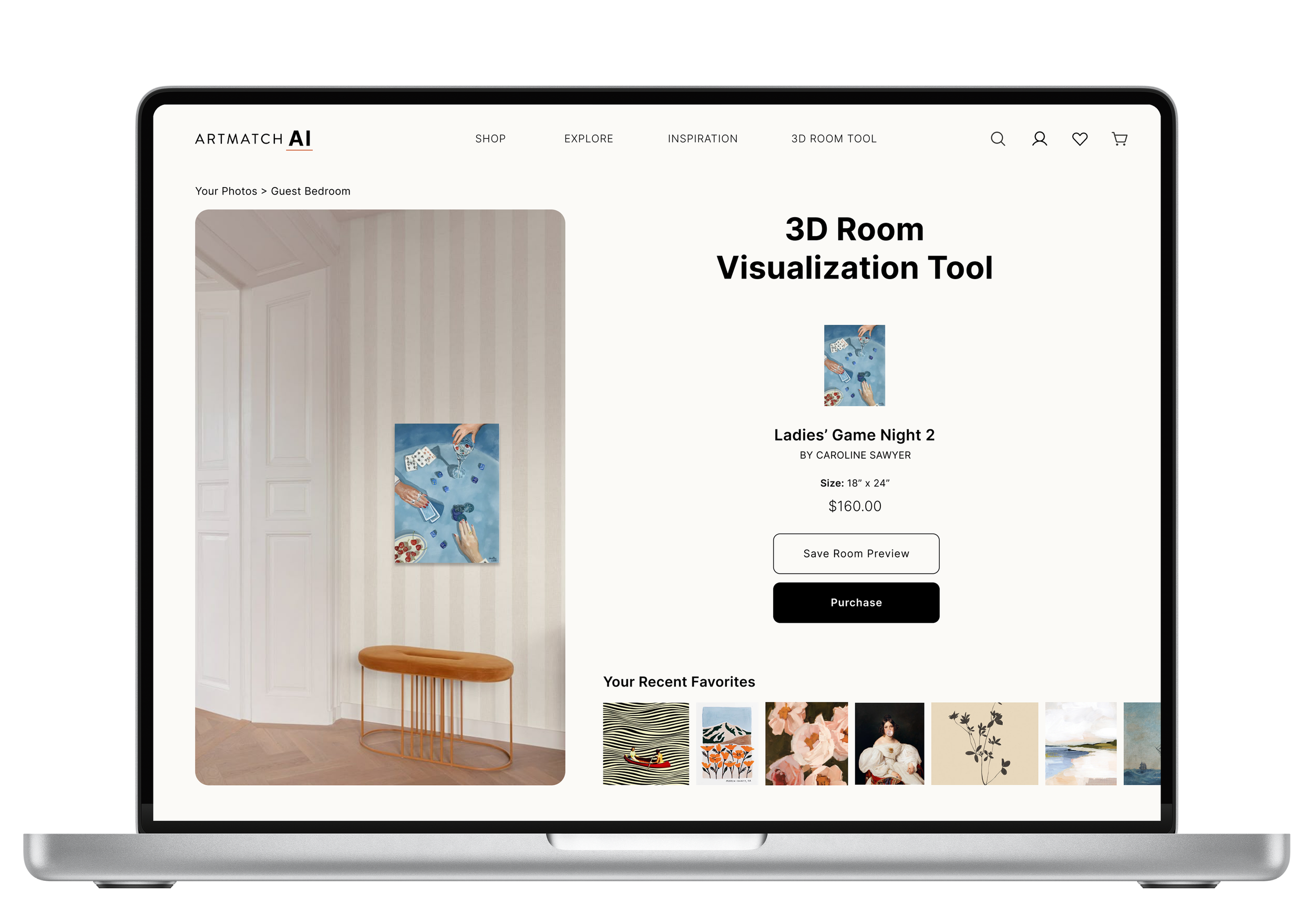
3. 3D Room Visualization Tool
A major feature of ArtMatch is the ability to preview artwork in your home using AR. It was important to design this experience to feel cohesive with the overall aesthetic and genuinely support users in their purchase decisions.
Used clear copy and visual cues to guide users through the AR experience
Added CTA buttons throughout the site so users could easily access the AR preview from multiple touchpoints
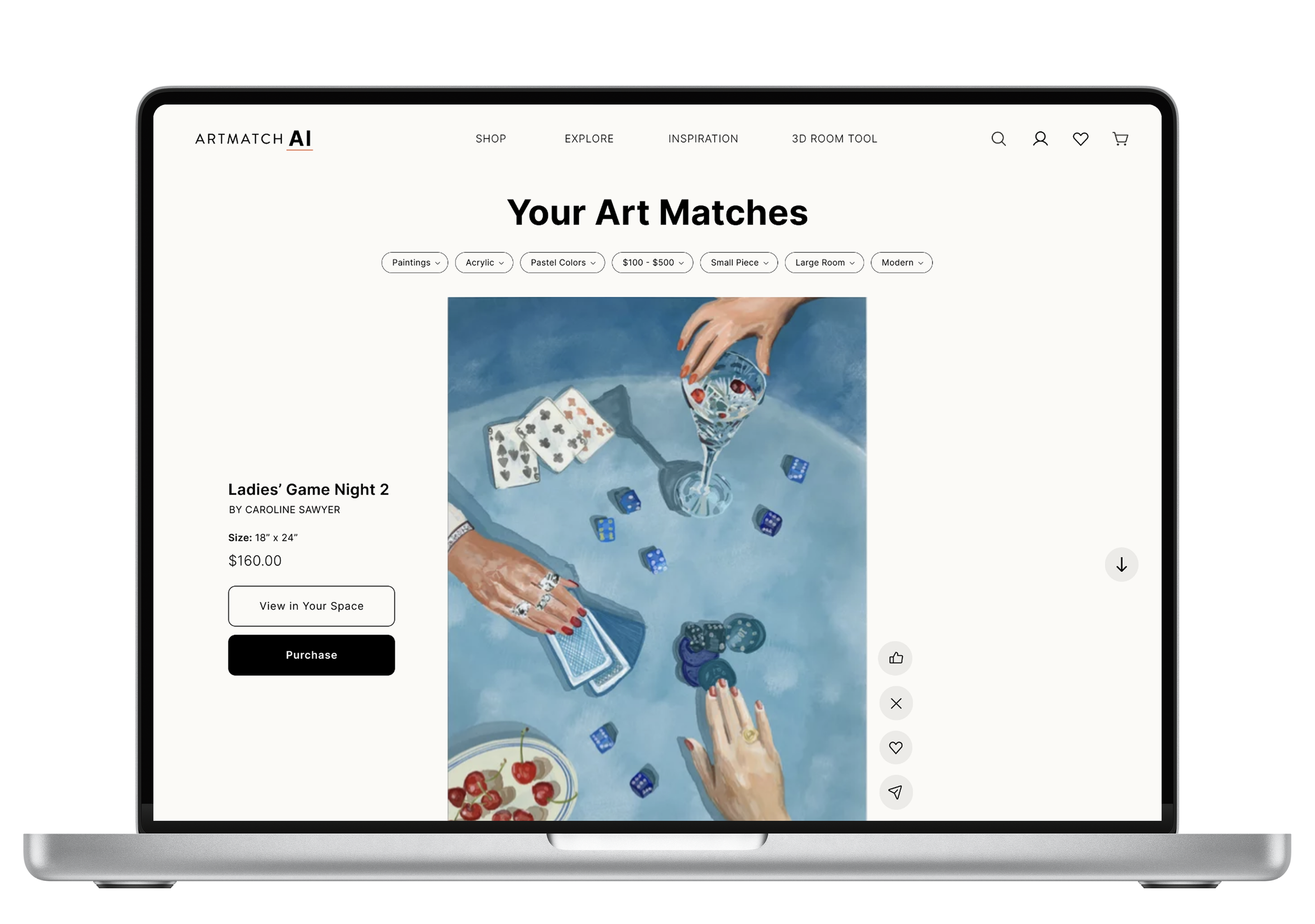
4. User Interaction with Artwork
We needed a way for the AI to learn more about a user’s preferences without being overly obvious or disruptive, so I added intuitive interaction buttons alongside each piece of art, allowing users to easily engage as they scrolled.
Created subtle, non-intrusive buttons for actions like liking, hiding, and adding to favorites
Made it simple for users to influence their experience without feeling overwhelmed.

Design Thinking & UX Principles Applied
I applied a design thinking approach by focusing on empathy and understanding user needs. I prioritized creating practical and engaging solutions, such as AI-powered recommendations and visualizing art in the user's space, to address the main pain points.
I used UX design principles like:
Clarity: Designed a simple and clean interface.
Consistency: Ensured uniform UI elements for easy navigation.
Discoverability: Made actions and content easy to find.
Feedback: Added visual cues for interactions like saving and favoriting.
Design Decisions
Every design decision was made with the user journey and experience in mind. I focused on creating an enjoyable, intuitive way for users to discover and interact with art, removing unnecessary obstacles along the way.
1. Our Interface Aesthetic
Showcasing art means working with a lot of competing visuals, colors, and patterns on the screen at once. To avoid overwhelming users, I focused on creating a clean, modern interface with generous white space that keeps the artwork front and center.
Used visual hierarchy and white space to guide the eye and reduce cognitive load
Took a minimalist approach to keep the experience calm, focused, and engaging
2. Search Feature
We knew we needed a strong search experience to help users navigate a large and diverse art catalog, but a basic search bar wouldn’t be enough. So I designed a visual-first search that spanned the full width of the page and was accessible from anywhere on the site, making exploration feel intuitive and inviting.
Included filters like material, color, and style to support meaningful discovery
Surfaced past searches, trending topics, and personalized terms to spark inspiration and help users revisit favorites
3. 3D Room Visualization Tool
A major feature of ArtMatch is the ability to preview artwork in your home using AR. It was important to design this experience to feel cohesive with the overall aesthetic and genuinely support users in their purchase decisions.
Used clear copy and visual cues to guide users through the AR experience
Added CTA buttons throughout the site so users could easily access the AR preview from multiple touchpoints
4. User Interaction with Artwork
We needed a way for the AI to learn more about a user’s preferences without being overly obvious or disruptive, so I added intuitive interaction buttons alongside each piece of art, allowing users to easily engage as they scrolled.
Created subtle, non-intrusive buttons for actions like liking, hiding, and adding to favorites
Made it simple for users to influence their experience without feeling overwhelmed.
Design Thinking & UX Principles Applied
I applied a design thinking approach by focusing on empathy and understanding user needs. I prioritized creating practical and engaging solutions, such as AI-powered recommendations and visualizing art in the user's space, to address the main pain points.
I used UX design principles like:
Clarity: Designed a simple and clean interface.
Consistency: Ensured uniform UI elements for easy navigation.
Discoverability: Made actions and content easy to find.
Feedback: Added visual cues for interactions like saving and favoriting.


Lessons Learned & Next Steps
Early on, I struggled with creating logical user flows and making confident design decisions. It became clear that I didn’t fully understand the product’s core purpose, which is essential. Asking questions, even ones that feel obvious, was key to designing something meaningful and effective. I learned there are no dumb questions and clarity leads to better outcomes.
Asking clarifying questions early leads to more intentional design.
Helping engineers bring the design to life is part of the job.
Part of a designer’s role is to ensure the final product reflects the design as closely as possible. When things look off during implementation, it's important to open up a conversation with engineers to understand any constraints and collaborate on solutions, which is something I learned during this process.
Design mentorship and collaboration can really strengthen the work.
As the only designer on a cross-functional team, I realized how valuable collaboration with other designers can be. Having feedback, mentorship, or even casual design chats would have helped push my thinking and likely led to an even stronger final product.
Next Steps:
Expand and Refine Key Features
While the foundation is in place, this product is still evolving. Several core features are actively being built, and ongoing design support will help bring them to life thoughtfully and cohesively.User Testing & Iteration
Conduct usability testing with target users to validate design decisions and uncover friction points based on real-world behavior.Design for Mobile
Adapt the experience for mobile and tablet, ensuring a seamless, intuitive interface that maintains clarity across screen sizes.Continue to Collaborate with Development
Partner closely with engineers to ensure accurate implementation and a smooth handoff that preserves the design vision.