
FORM App
Redesign
An exploratory redesign of a popular fitness app to optimize content, improve navigation, and lay the foundation for future features.
Project Overview
FORM is a fitness and nutrition app that helps users reach their health goals through curated workout programs and meal plans. As a frequent user, I’ve struggled with its cluttered homepage, making it hard to quickly find key features like workouts and recipes—an issue echoed in user reviews.
This conceptual project focuses on redesigning the homepage for a cleaner, more intuitive experience that prioritizes user needs while setting the stage for future enhancements like progress tracking.
My Role
UX Designer
UX Researcher
Timeline
3 Weeks
Tools
Figma
Problem Statement
FORM’s cluttered homepage makes navigation difficult, frustrating users and making key features hard to find. The lack of progress tracking also prevents users from monitoring their fitness journey or seeing completed classes, reducing motivation.
User reviews confirm these frustrations, highlighting poor usability and the absence of tracking as major pain points.
Solution
Redesign the homepage with a clean, intuitive layout that improves navigation, highlights key actions, and enhances usability. This will also pave the way for integrating progress tracking.
Goals
Simplify the interface
Improve navigation
Prioritize user needs
Enable future progress tracking
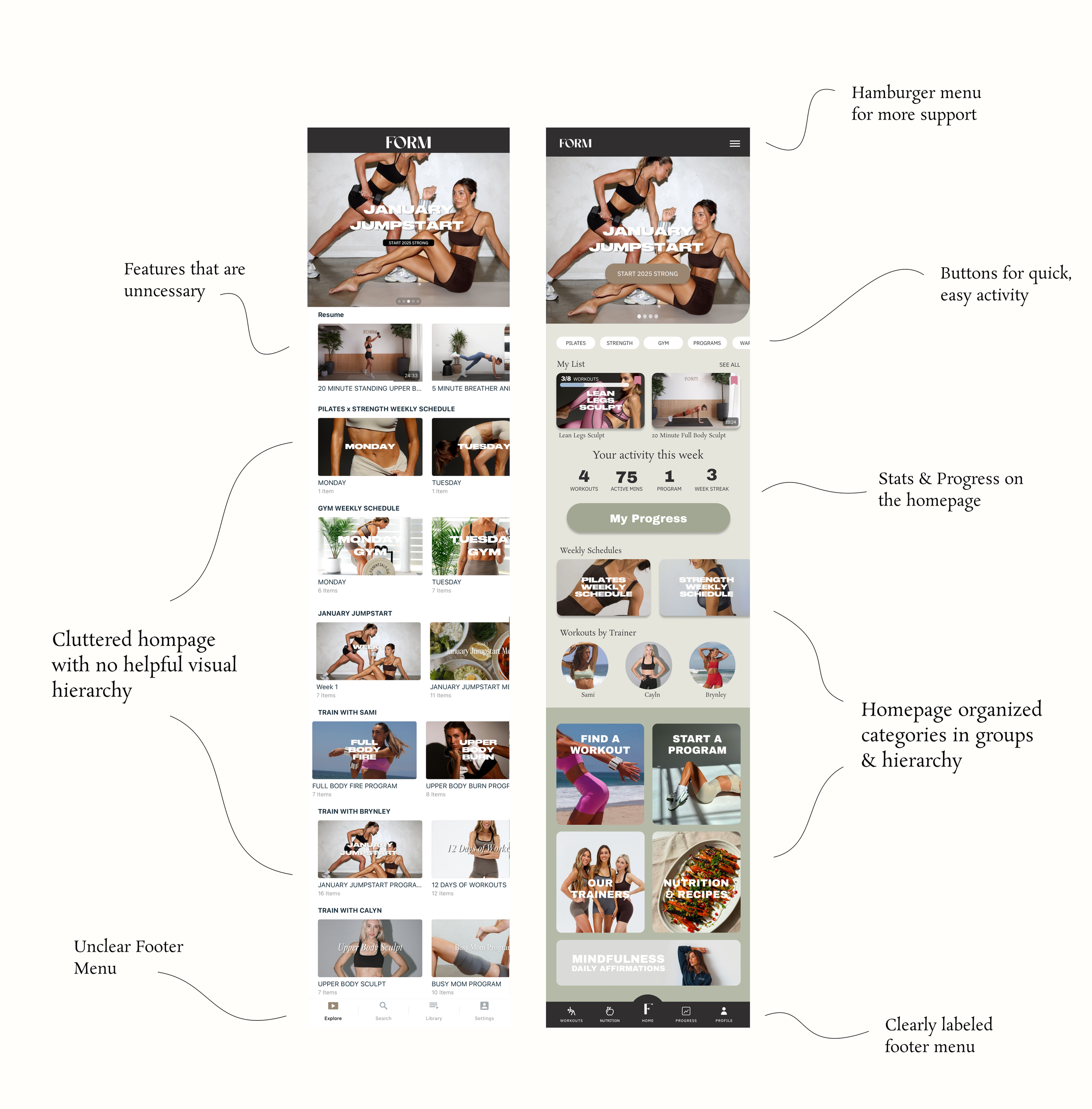
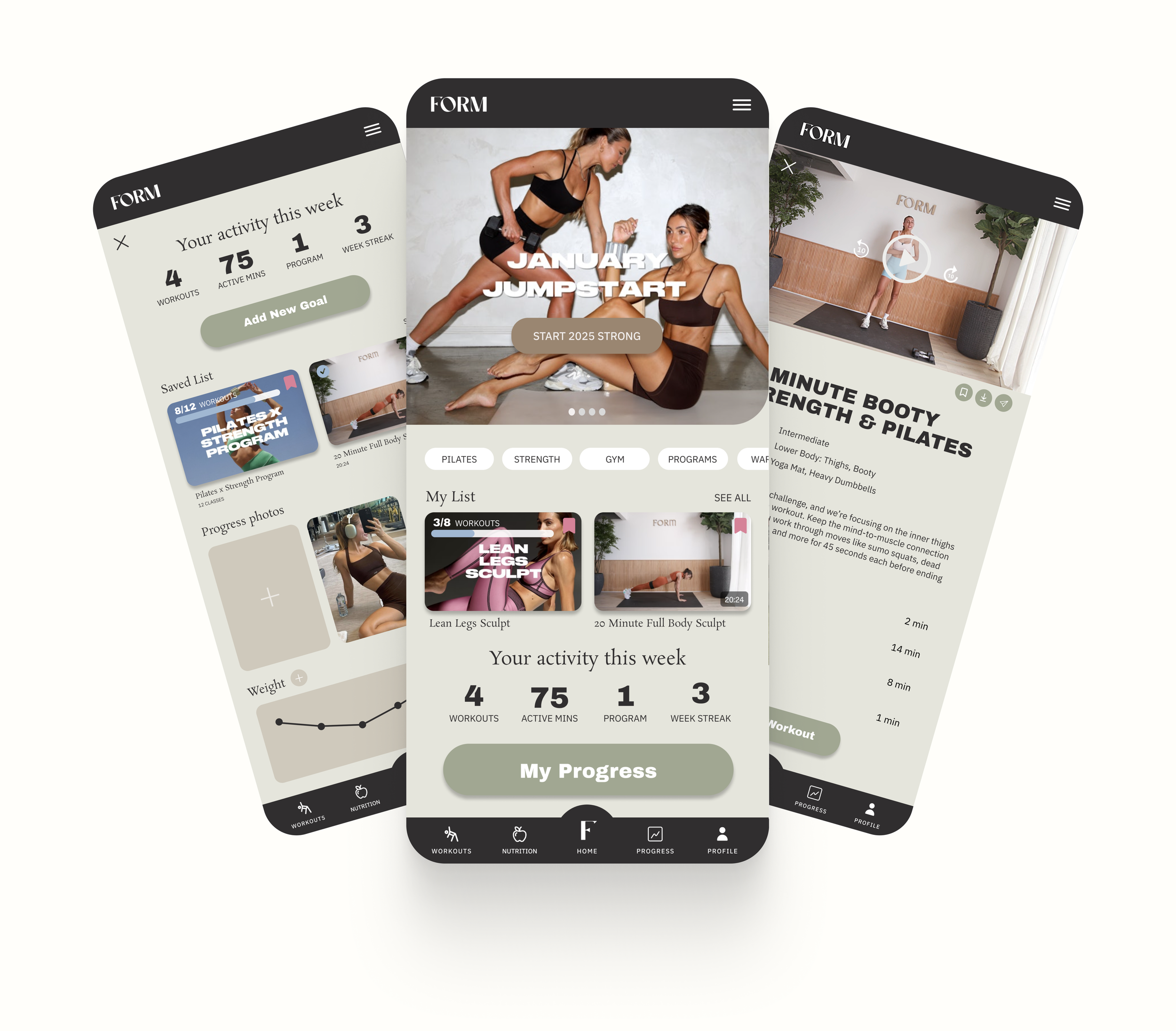
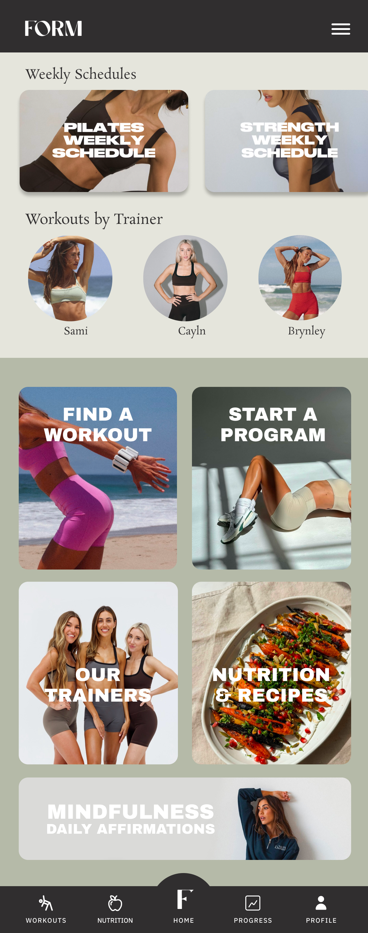
Homepage Redesign
BEFORE
AFTER
Research Insights:
Market Research & User Reviews
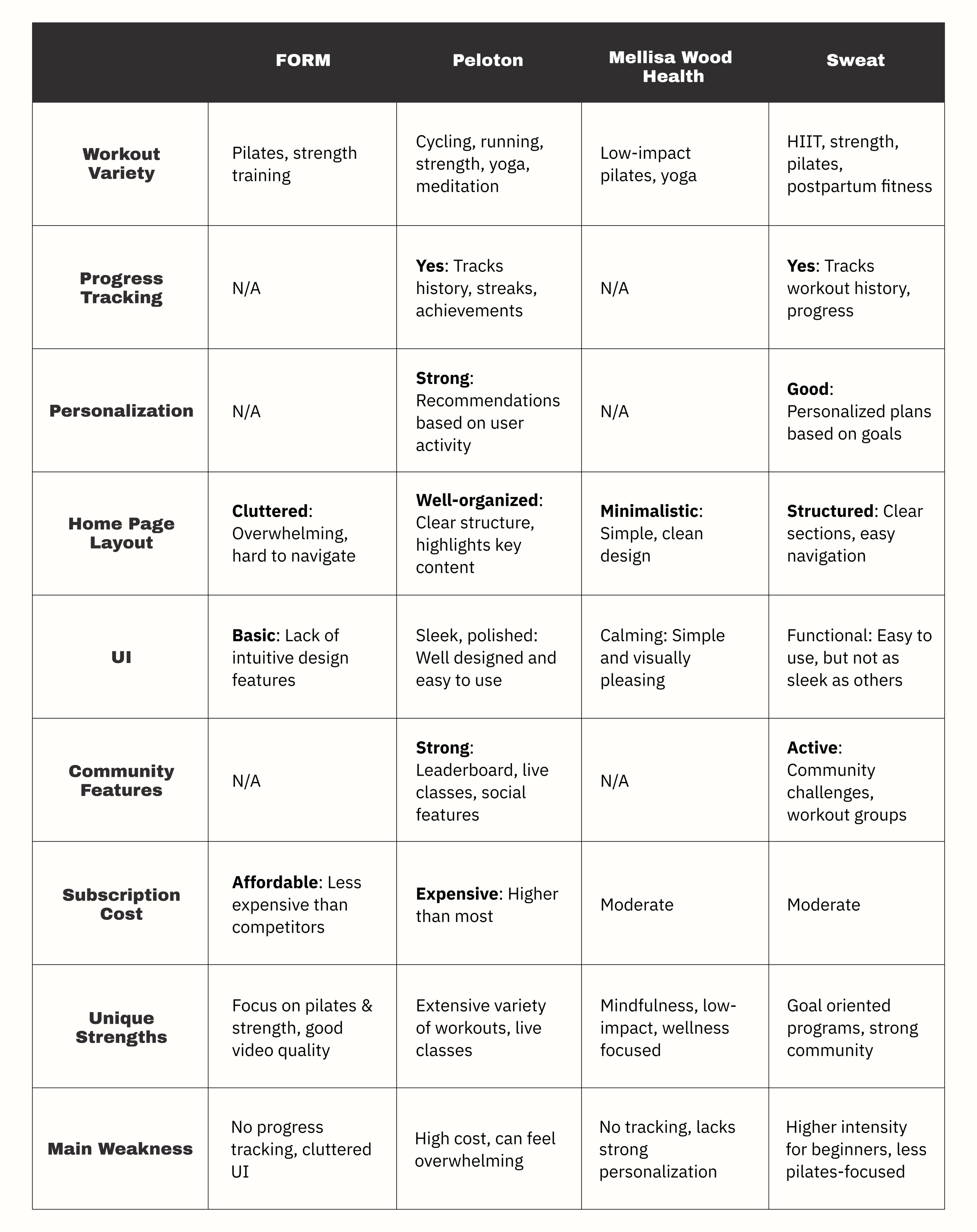
Market Research: Competitive Analysis
To gain insight into industry standards and user expectations, I conducted market research by analyzing popular fitness apps. This helped me identify best practices and better understand where the FORM app was falling short, guiding my approach to the redesign.
To better understand user pain points, I analyzed reviews of the FORM app in the App Store, identifying common patterns and recurring issues. This research revealed key frustrations, such as difficulty navigating the homepage and the lack of progress tracking, which helped inform my design decisions.
User Reviews & Feedback
“The app isn’t user friendly.”
“There is no way to track your workouts, I can’t really remember if I’ve done them before and I’d like to be able to see my progress (as I know exists on other apps).”
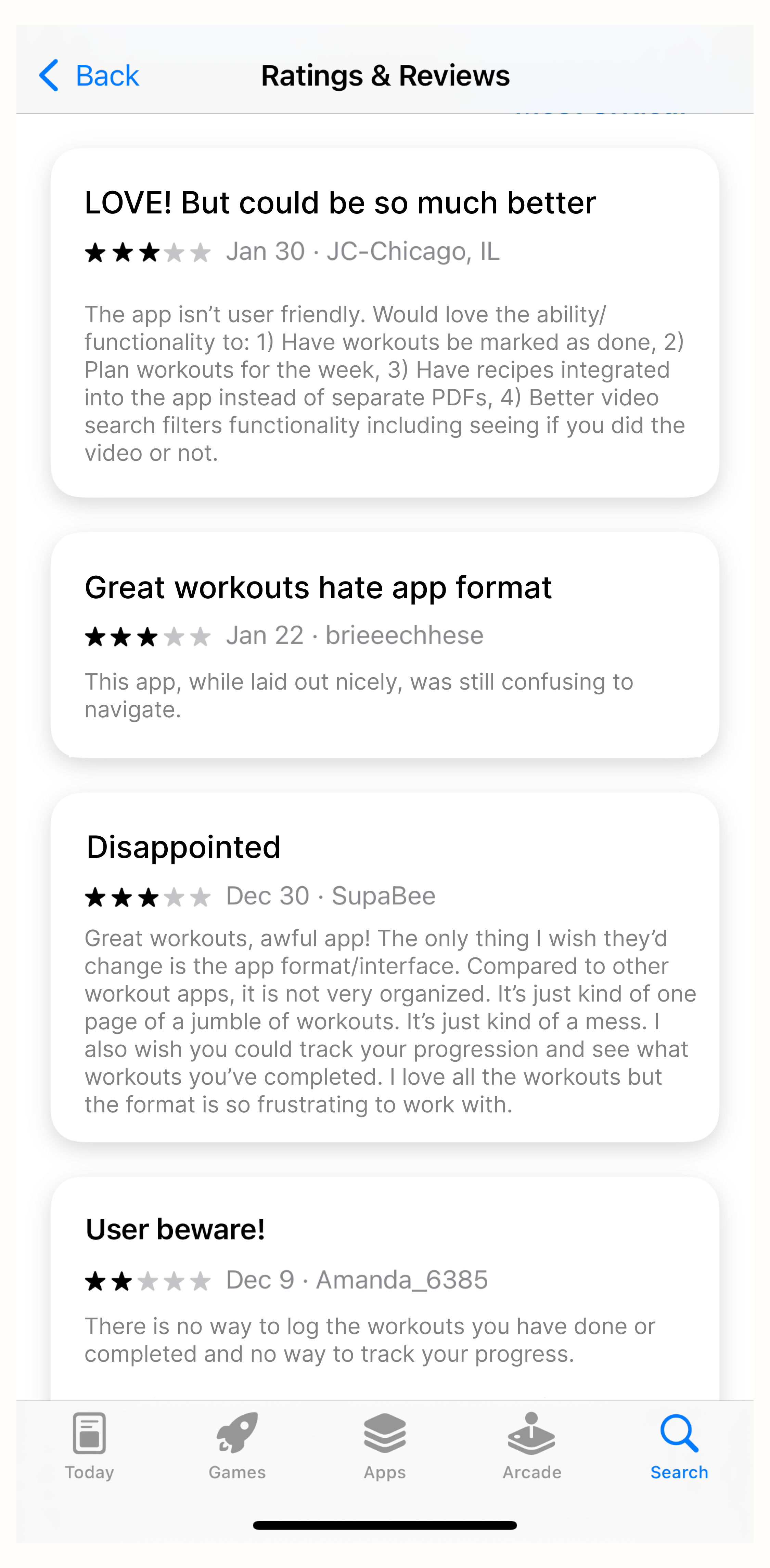
“I wish there was a streak on the app or some kind of record of all the classes completed. I find those stats quite encouraging and it gives me a better sense of where I am at in my fitness journey.”
“Great workouts, awful app!”
Key Pain Points
Cluttered and Overwhelming Home Page – Users found the layout disorganized, making it difficult to quickly find and access workouts.
Lack of Progress Tracking – Unlike competitors, FORM does not offer a way for users to track their workout history, making it harder to see improvements over time.
Limited Personalization – The app doesn’t tailor recommendations based on user preferences or workout history, leading to a less engaging experience.
Navigation Challenges – Users reported difficulty navigating the app efficiently, often feeling like key content was buried or hard to find.
Missed Opportunities for Engagement – With no community features or streaks, users lacked motivation to stay consistent compared to other fitness apps.
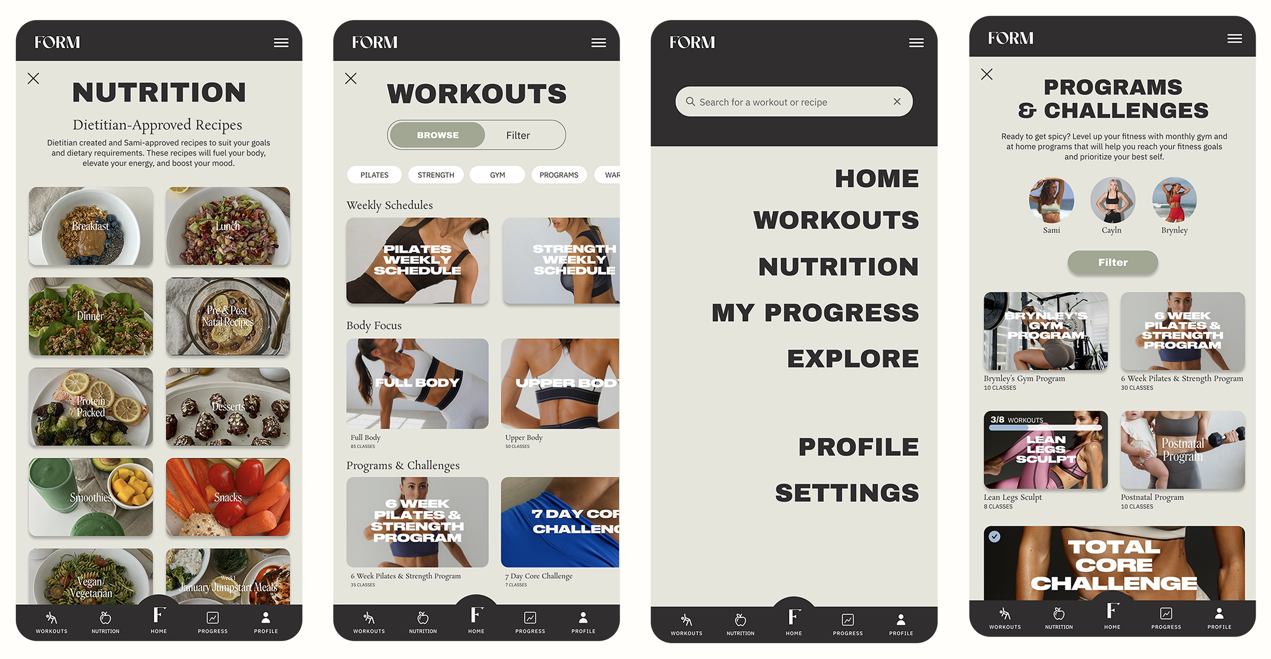
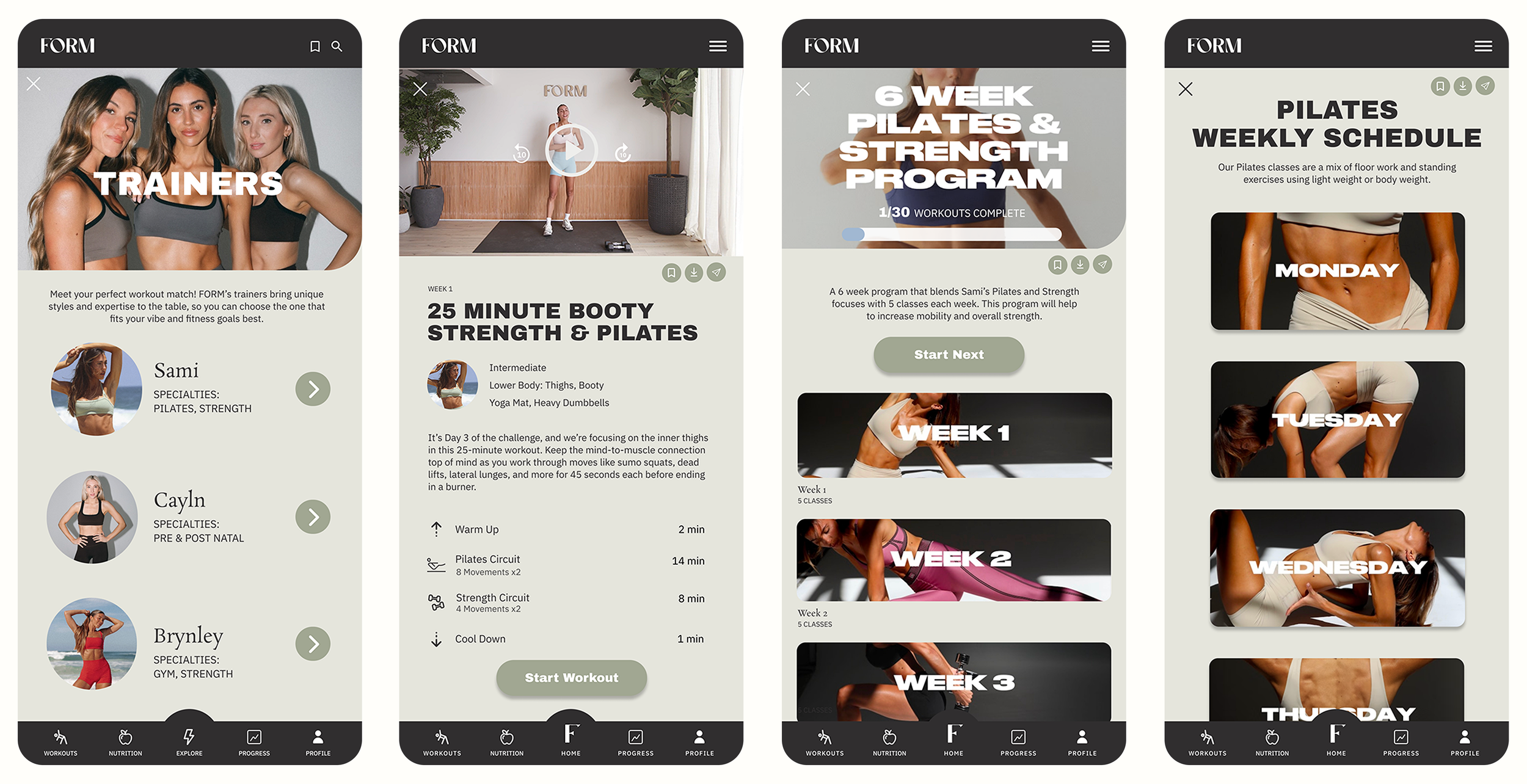
Information Architecture Overhaul
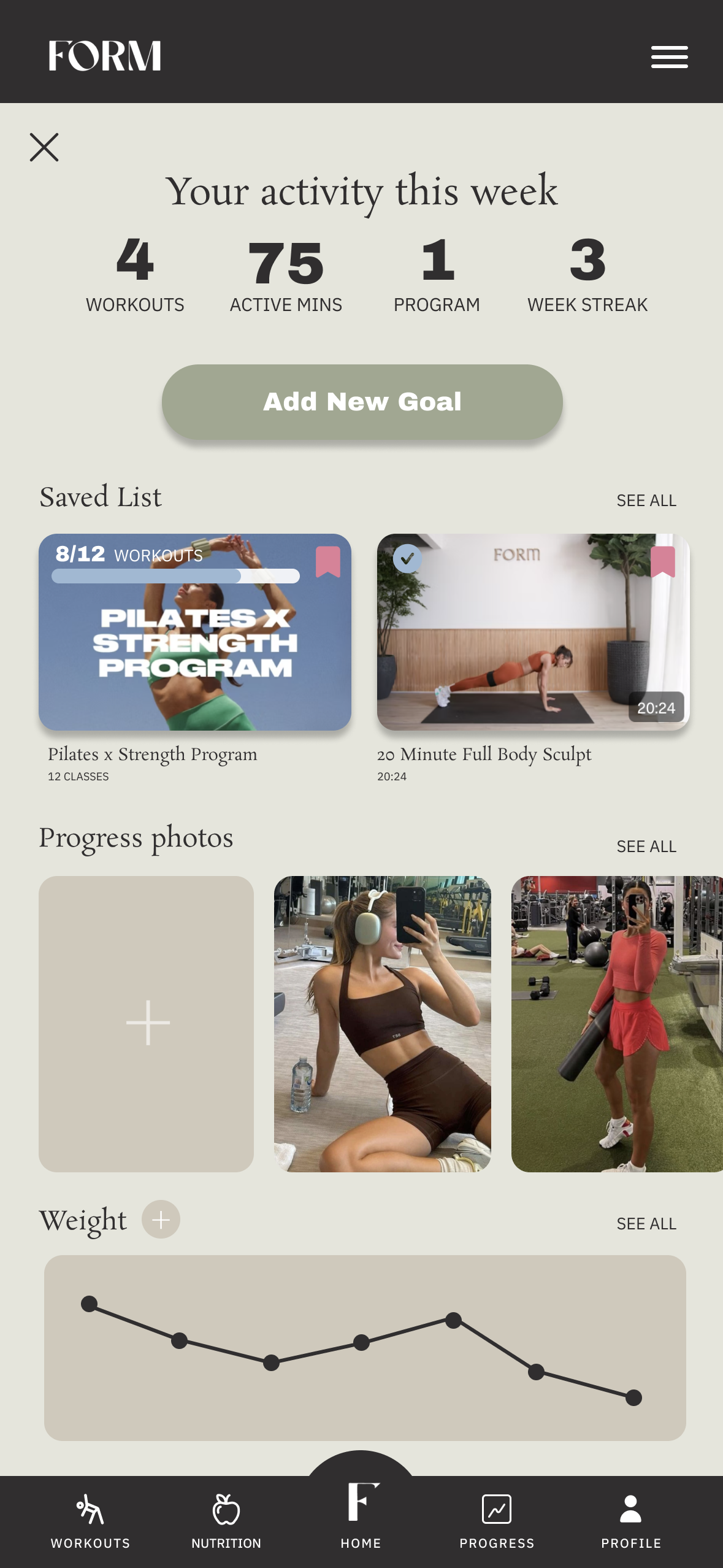
Progress Tracking Dashboard
Task Completion Signifiers
Key UX Redesign Features:
Problem: The app’s navigation was cluttered and unintuitive, making it difficult for users to find relevant workouts and features quickly.
Solution: Restructured the information architecture, grouping content logically, improving menu organization, and making key workouts more accessible.
Why It Was Needed: Users often felt lost, scrolling endlessly and clicking through multiple sections just to find a class. A clearer structure reduces friction and frustration when navigating the app.
How It Helps Users: Users can quickly locate workouts, discover new content, and navigate with ease, creating a more seamless and user-friendly experience.
Information Architecture Overhaul
Progress Tracking Dashboard
Problem: The app lacked a way for users to track their progress over time or view completed workouts, making it difficult to see improvements or stay motivated.
Solution: Designed a progress tracking dashboard that displays workout history, achievements, and progress statistics, laying the foundation for deeper insights in the future.
Why It Was Needed: Competing apps offer tracking features that help users stay engaged and motivated. FORM lacked this, putting it at a disadvantage and causing user frustration.
How It Helps Users: Users can now view their workout history at a glance, stay motivated by tracking their progress via photos and weight charting, and feel more invested in their fitness journey.
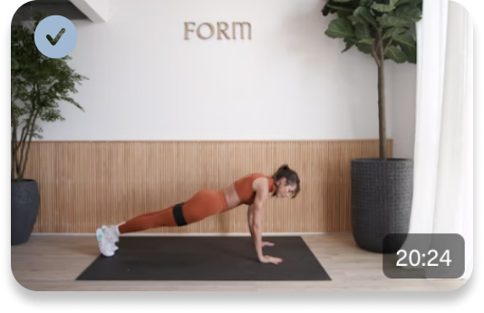
Task Completion Signifiers
Problem: Users had no clear indicators of which workouts they had completed, leading to confusion and difficulty tracking progress.
Solution: Added visual task completion signifiers (such as checkmarks, progress bars, or subtle UI changes) to indicate completed workouts.
Why It Was Needed: Without completion indicators, users had to rely on memory or manually track their progress, which disrupted the experience and made it harder to stay consistent.
How It Helps Users: Users can now instantly see what they’ve completed, making it easier to stay motivated and plan their next workout without guesswork.

After conducting a usability test with five participants—some familiar with the current FORM app and others new to it—I identified key areas for improvement. The feedback led to revisions that focused on making workouts easier to access, improving the weekly schedule feature, and clarifying navigation elements to enhance the overall user experience.
Usability Testing
Insights & Improvements

1. Faster Access to Workouts on the Homepage
Users wanted a more streamlined way to jump into workouts without excessive scrolling or going to a Workout section. To address this, I:
Added workout categories (Strength, Pilates, Gym, etc.) at the top for quick selection.
Rearranged the homepage layout to prioritize categories, trainers, and schedules upfront.
2. Clearer Organization of the Weekly Schedule
Users expected the weekly schedule to be structured by type of schedule (e.g., Gym Plan, Strength Focus) rather than by day of the week. To improve this, I:
Redesigned the weekly schedule view to allow users to select a structured program first, rather than having to browse by individual days.
3. Improved Navigation
Users found the "Explore" tab in the footer menu unclear, often expecting it to function as a search feature. To resolve this, I:
Replaced "Explore" with a more intuitive label, “Home”, aligning it with user expectations.
Added a hamburger menu to centralize navigation, making it easier for users to access key sections of the app in another useful way.
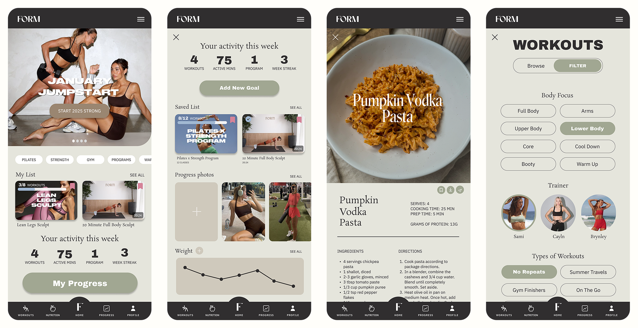
Hi Fi Prototype
After refining my designs based on research and user feedback, I developed a high-fidelity prototype to bring the improved experience to life.
Lessons Learned & Next Steps
User feedback is invaluable for refining design decisions.
Prioritizing user feedback ensures that solutions are rooted in real needs rather than personal design preferences. Users often reveal the most pressing pain points, and addressing those directly leads to the most impactful design improvements.
Visual feedback enhances motivation and completion rates.
Visual feedback is a powerful motivator. People are naturally driven by progress visibility, and incorporating simple, intuitive signifiers can enhance user satisfaction and retention.
The importance of information architecture in user engagement.
Thoughtful information architecture isn't just about organizing content, it directly influences usability and user retention. A well-structured homepage reduces friction, allowing users to focus on their workouts rather than struggling to navigate the app.
Next Steps:
Additional User Testing
Conduct another round of usability testing to ensure the new design changes are working well and to gather more feedback.Iterative Design Improvements
Refine the design further based on testing results to improve usability and address any remaining issues.Expanding Features
Continue enhancing current features and explore adding new ones, like workout reminders or social sharing, to keep the app engaging for users.