
The Cape Gallery
UX Design
Giving museum goers the ability to be their own tour guide
Research
Define + Ideate
Prototype
Testing
Hi Fi Mockups
Lessons Learned
Project Overview
There is a lack of in-depth descriptions and background information about artwork in museums for visitors unless they sign up for a lengthy tour with a guide, which is often rigid in length, expensive, and with a group of strangers.
The Challenge
The Solution
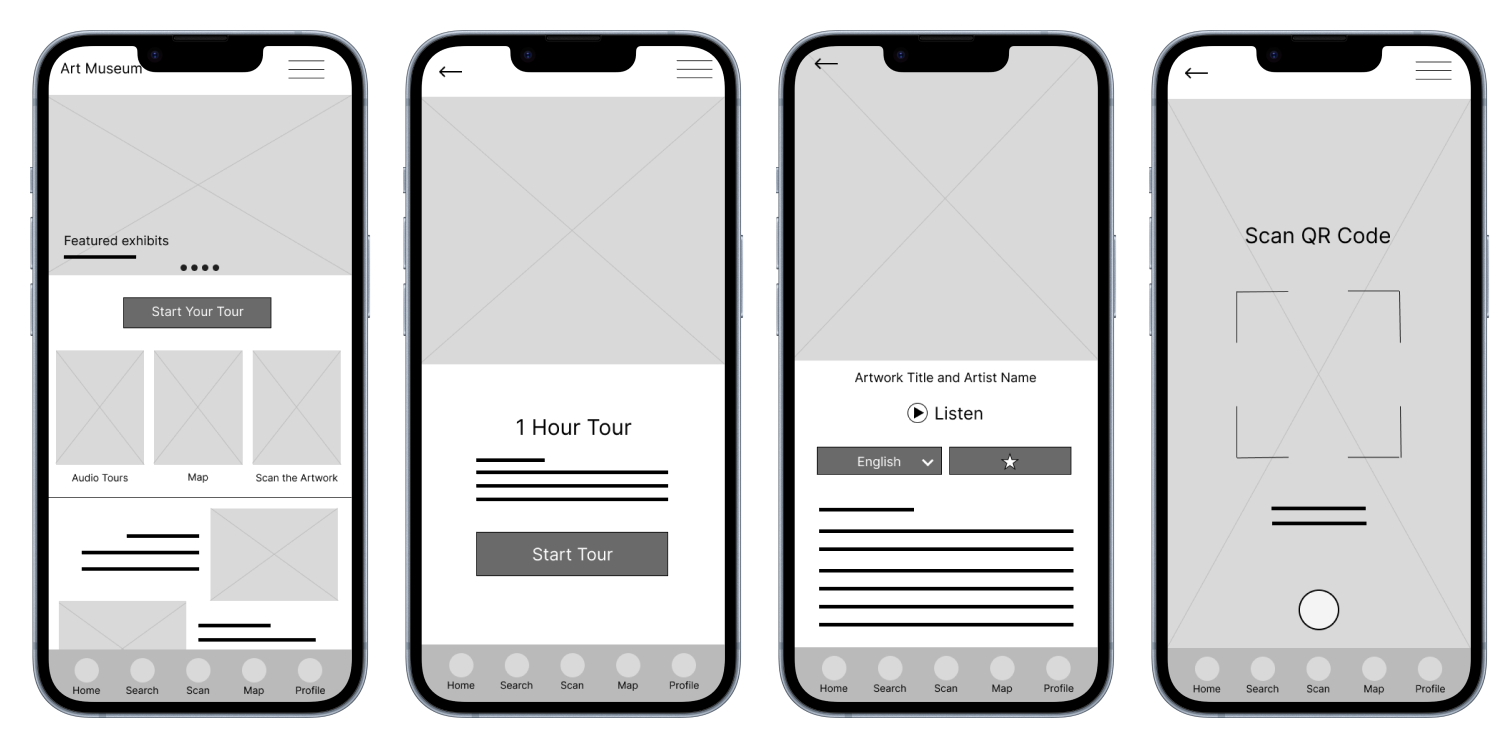
For my capstone project, I created an easy to navigate Audio Tour App for users who want to explore a museum at their own pace whether through various highlighted audio tours, browsing by art collections and current exhibits, or scanning individual artworks to learn more all from a user's own mobile device.
My Role
UX/UI Designer Timeline
3 MonthsTools
Figma, Figjam
Design Thinking Process

Empathize
User Research
Understand the experiences people have at museums.
Understand how in demand guided tours are or are not.
Assess if a scanning and searching feature for artwork in a museum is practical.
Identify competitors and evaluate strengths and weaknesses.
Discover pain points with current museum experiences.
Research Goals
I conducted interviews and surveys to gather insights on how individuals feel and what they think about their current experiences while visiting museums. We focused our research on people who frequent museums/art galleries both in their own cities or while on vacation, and included individuals of different ages, ethnicities, and disabilities. After reviewing the results of our research and creating an empathy map, we found 4 key user pain points.
Museums can be really loud and crowded.
Not enough context or information to appreciate the artwork.
Don’t want to commit to a long tour with a guide.
Want to see only the most important pieces.
Pain Points
Competitive Analysis
I selected three key players for competitive analysis. Of the three, two were direct competitors: Smartify and Nordic Museum Audio Guide, both of which are smartphone applications designed specifically for museum audio tours. The remaining competitor, ArtRabbit, was considered an indirect competitor, as it primarily provides information about art exhibitions and events, but does not offer audio-guided tours.


User Persona
Problem Statement:
Keith is a retired architect with hearing impairment who needs a way to enjoy a busy art museum without a formal tour guide because wants to go at his own pace and have an enjoyable visit.
User Journey Map
I created a user journey map for Keith to showcase the various pain points and areas for improvement during his various tasks.

Define + Ideate
Design Process
I began the design process by focusing on Information Architecture to create a clear paths for users to navigate through the app and intuitively move through the pages. Once I had the general site map, I was able to begin the layout design process starting with hand drawn wireframes and low fidelity mockups.
I wanted users to have a very clear and easy flow while using the app by limited options. However, as the project went on there were a few more options added to the homepage, giving users more ways to use the app.Site Map

Wireframes
I used pen and paper to create first drafts of key features and layout ideas.
Test
Usability Study
With my lo fi prototype completed, I then recruited participants and conducted usability testing in order to see how users interact with my design, what they were naturally drawn to within the app, and lastly, to identify any pain points and opportunities for improvements to the design.Give users various tasks to complete and see if they are easy to complete
Watch what users are naturally drawn to do when they open the app
Understand areas of concern and confusion
Test Objectives
Tasks
Open the app and start a tour of your choice
If I told you to Scan a QR code, would you know what to do?
Are you able to find a way to change a language when starting an audio tour?
I asked participants to complete tasks such as:
Affinity Map
3/5 reported issues with the layout and format
4/5 mentioned the lack of a search option that was easy to find
4/5 thought more descriptive and useful text and icons would be helpful
4/5 were confused by the map and had feedback to improve that feature
Pain Points
Users want more text descriptions to help them navigate the app
Users want a more detailed and interactive map
Users want an easy way to search when on any page
Insights
Add a static search button in the header
Add a search bar on the home screen
Break up the images with more thoughtful and helpful text and call to action buttons
Add a 'You Are Here' feature to the map to help users find what is around them
Recommendations
I prioritized the findings from my usability study and made several key changes to my design to help address the pain points of my users and help provide a more enjoyable experience, including a search function, larger call to action buttons, and iconography in the navigation bar.
Priority Revisions
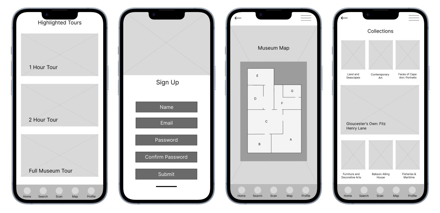
Hi Fi Mockups
Based on the feedback from the usability study findings I made changes to multiple pages including the homepage where I added a search function, large call to action buttons, and included iconography in the navigation bar. I also created consistency through the app with a color scheme, text, and buttons.


Mobile + Desktop Hi Fi Mockups
After the app design was complete I wanted to create a mobile and desktop website to showcase the app and it’s features. This site would be used to get customers to the platform, provide extra information about the museum, and give users a look into what the app offers.


Lessons Learned
Designing for many people with varying needs is a lot more complicated than I had initially thought. There are a lot of necessary steps in the UX process to help avoid bias and design preferences before arriving at a workable and impactful solution. Well executed research provides the most helpful data to work with.
Research Helps to Avoid Bias
At the beginning on the project I had so many ideas that I spread myself thin and quickly had too many pages and features to handle. In the future I would keep my designs and initial user flow very simple to start so that I can focus on getting the basics done well. From there I would add on extra pages and features.
Keep Designs Simple to Start
Understanding accessibility and taking those concepts into consideration from the beginning of the design phase will help save a lot of time down the line. I ended up focusing on Text Hierarchy, Language Selection Options, and Color/Contrast for this project, but would like to be even more inclusive.
Accessibility Matters